UX/UI DESIGN - WEB & APP
CONNECTING CITY2SURF COMMUNITY
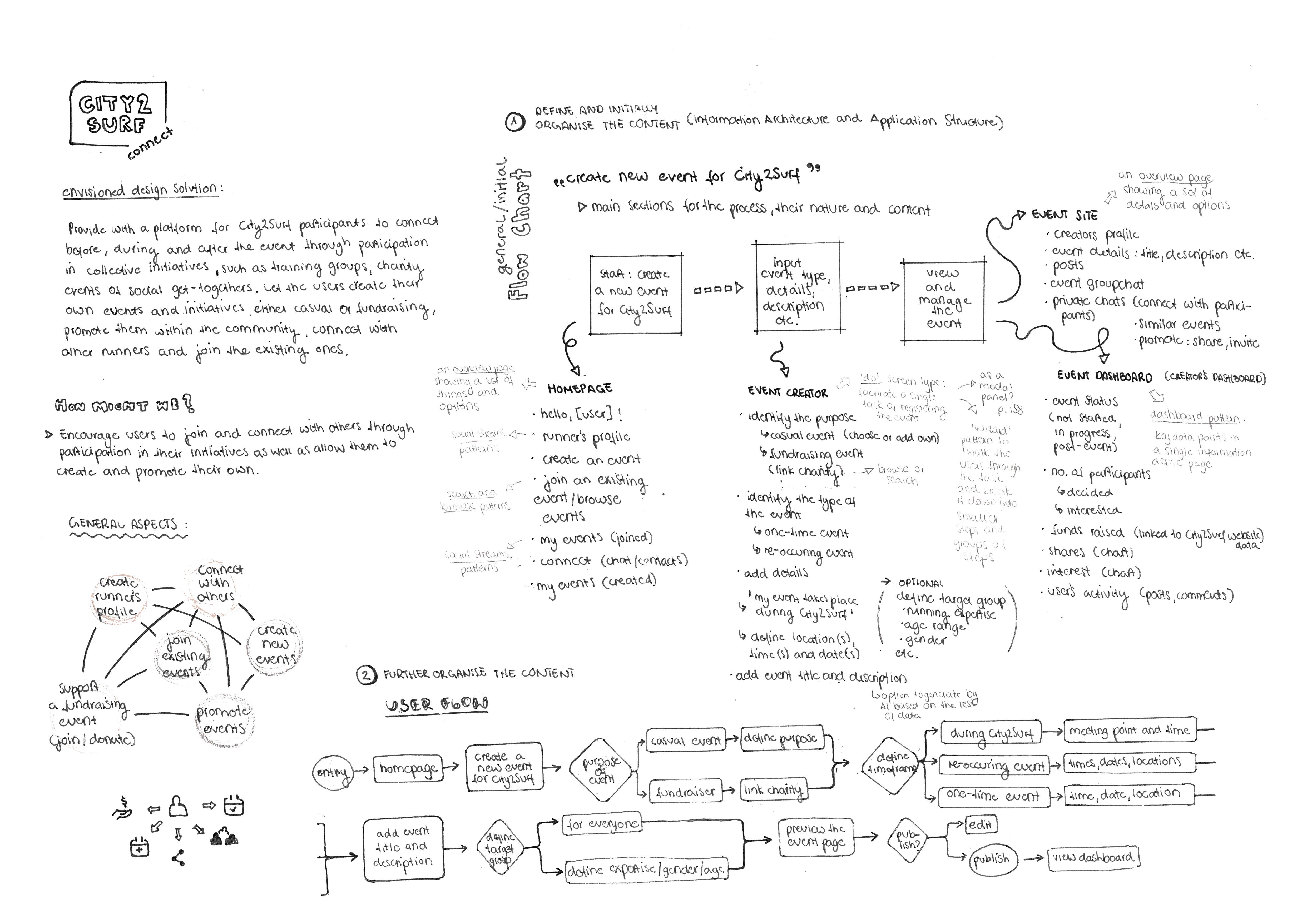
Educational project undertaken within the Interface Design course at the University of Sydney aimed to train in the creation of effective user interfaces ensuring seamless user experience and providing with user-centric products. The project covered all key phases of the design process—from problem space analysis (including background research, online ethnography) to developing a concept in response to the brief (through user persona creation, Jobs-to-Be-Done analysis, and user journey mapping). It involved competitor analysis, product development through sketching, wireframing, and iterative design, as well as building interactive prototypes, conducting heuristic evaluations, and user testing.


design process

User Research
COMPETITOR ANALISIS
STRATEGY
User Flow
WIREFRAMING
USER PERSONAS
balsamiq wireflow

Figma iterations

PROTOTYPING
product presentation
MOCK-UPS
Desktop & Mobile
INTERACTIVE DESIGN

Landing Page
01
Homepage/Dashboard
02
City2Surf Event Creator Landing Page
03
City2Surf Event Creator Pages
04
Custom Event Page
05
Bright, engaging entry point with a bold call to action. The layout is spacious and accessible, encouraging users to immediately join, create events, or donate. Clear icons and minimal text guide users smoothly into the platform.
The dashboard makes navigation effortless through intuitive iconography and top navigation links with its interface focusing on immediate participation.
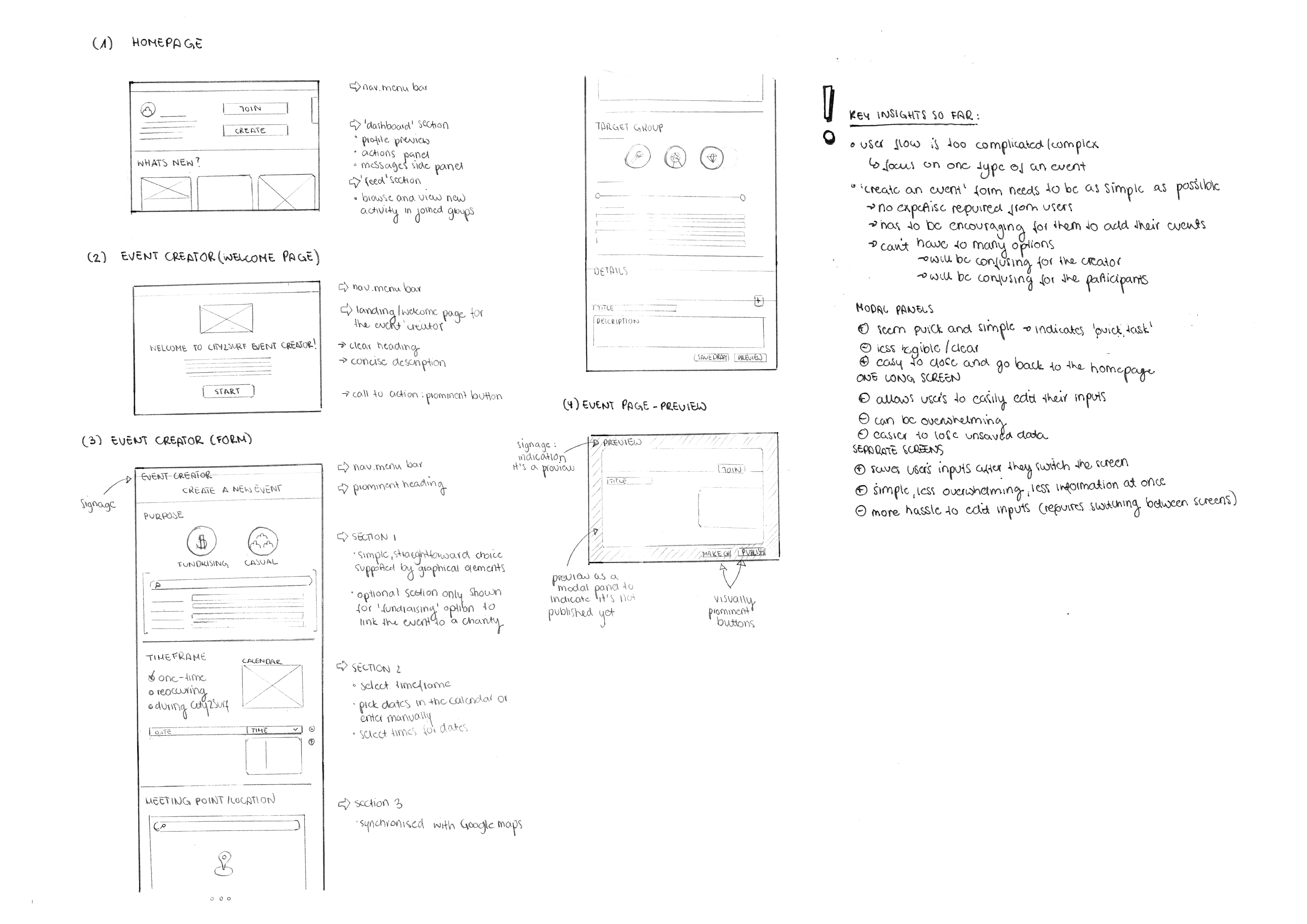
Introduces the Event Creator tool with friendly illustrations and a brief, motivating intro. The single-column layout provides strong visual focus, encouraging users to get started with minimal distraction. Prominent 'Get Started' button directly encourages users to access the service.
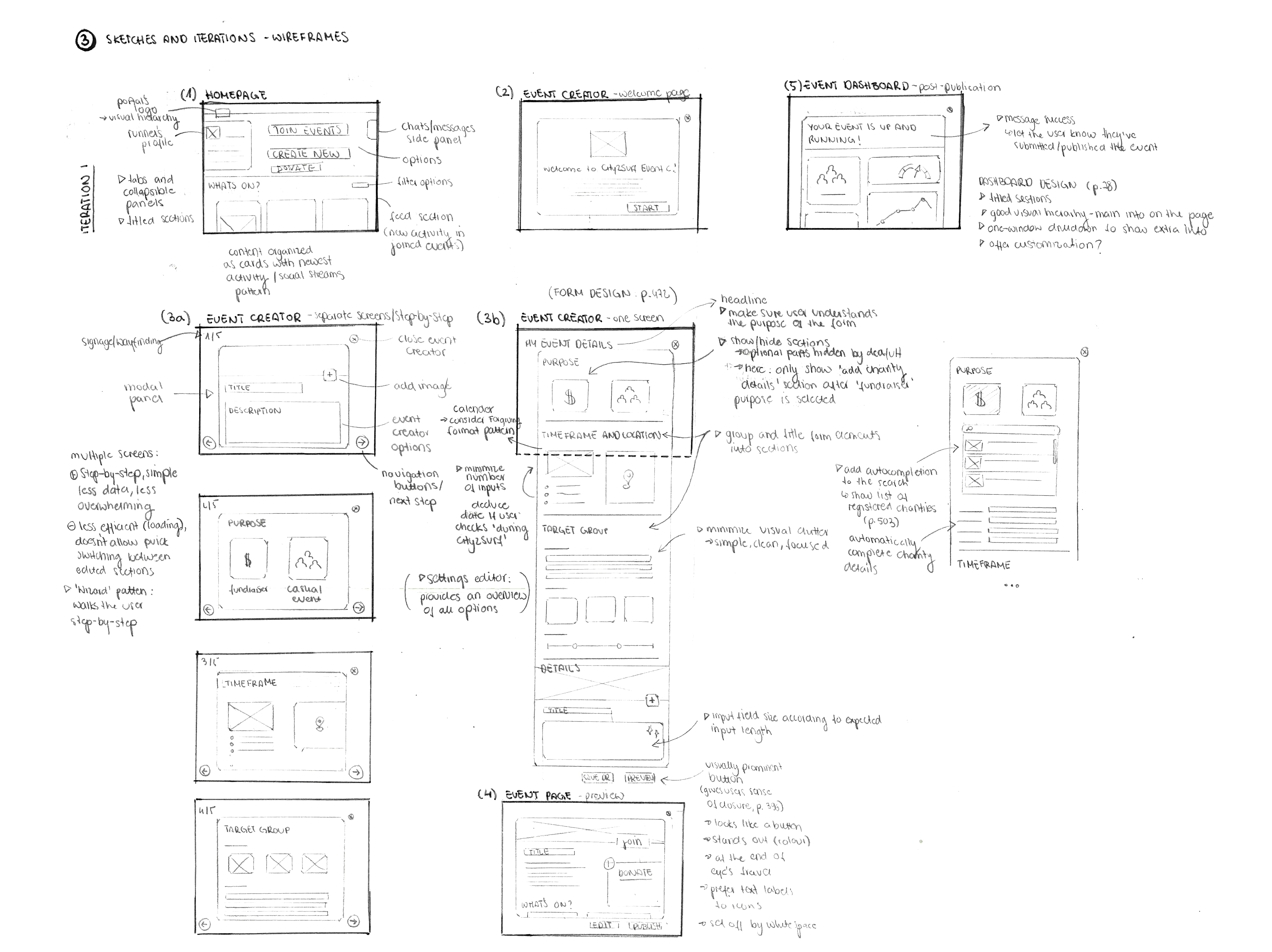
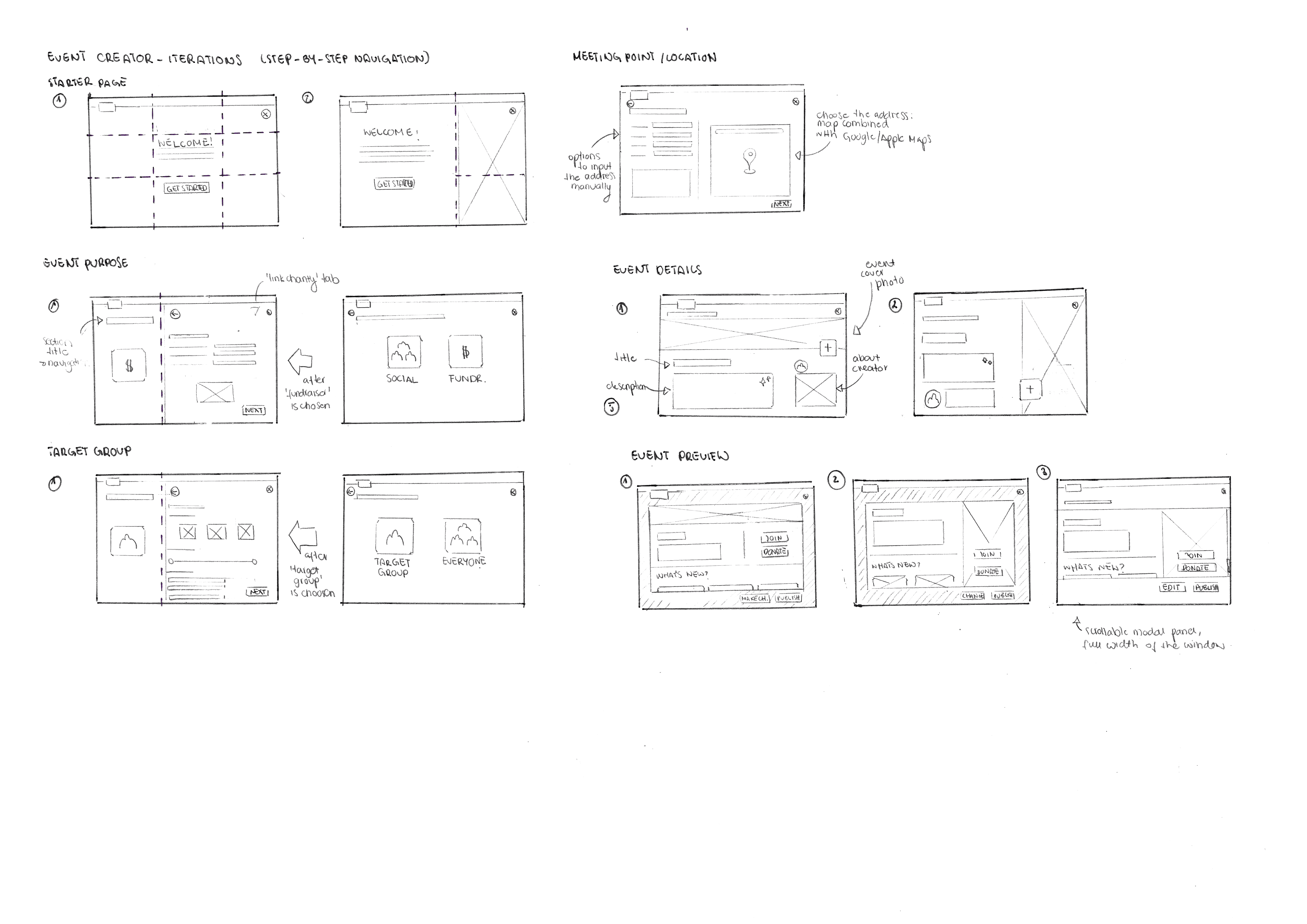
The step-by-step event creation process is organized
into clearly segmented screens, each with focused input areas. This design mimics a guided form flow—easy and logical to navigate and complete. Visual cues and minimal field clutter enhance clarity and usability across varied
event types.
Some of the following usability Heuristics and principles for User Interface Design have been considered and applied:
Show/Hide section of the form only shown after “Fundraiser” type of event is chosen to limit information on the page with simple, clean and focused input options to minimize visual clutter.
Panel identifying all steps in the Event Creator to inform users at which stage are they as well as allow them to easily switch between the tabs to enhance their creative process.
Prominent “Back” and “Next” buttons allowing users to easily switch between the tabs and stay engaged in their creative process.
Digital calendar to provide with multiple options of how to input data, considering Forgiving Format Pattern and by deafult deducing the date of the event same as the City2Surf date to minimize the number of inputs.
Event Preview Page showing as a modal panel to ensure the user they are performing a “heavyweight” task correctly.
Visually prominent "Publish" button at the end of eyes journey to give user a sense of closure.
Detailed yet clean event overview that balances content and interaction. Donation options, event info, and organizer contact are clearly displayed. Visual hierarchy and modular layout make it easy for users to engage, support, or share the event directly from the page.

Onboarding Screens
01
Onboarding screens for the City2Surf Connect App ensure a welcoming and intuitive entry point for new users. Designed to guide users step-by-step with friendly illustrations, playful micro-animations, all in a friendly, light-hearted spirit.
The UX prioritizes clarity and momentum:
Minimalist layouts keep focus on the core message.
Bold buttons invite immediate interaction.
Progress indicators create a sense of flow and orientation.
Homepage
02
The homepage screen offers a streamlined, user-friendly UX designed for quick action and personalized engagement.
The personalized greeting creates a welcoming, human touch that enhances user connection and reinforces identity within the platform.
The layout uses a clean vertical structure with large, icons that make it accessible to join, create events or donate with a single tap. The use of playful yet minimalistic iconography and dynamic type treatments keeps the experience light, energetic, and purpose-driven, perfectly aligning with the City2Surf spirit.
The burger menu in the top right corner provides seamless access to additional portal features without cluttering the main interface—maintaining focus on the primary actions.
City2Surf Event Creator
03
The City2Surf Event Creator adapts desktop-style survey design into a mobile-friendly, touch-optimized flow. It breaks the process into clear, single-step screens with large icons and buttons for easy tap interaction, whilst maintaining its original order and user flow. A visible progress indicator and bottom-positioned CTAs keep users oriented and engaged. Clean layout, conversational language, and context-driven inputs make the experience simple, accessible, and easy to complete on the go.
Customized Event Page Screen
04
The mobile UI for the custom Event Page screen is clean and action-focused. Featuring a bold title for easy navigation and simple layout it allows the users to easily access all of the crucial information about the selected/created event.
Two large buttons—DONATE and JOIN—are prominently placed for easy access, encouraging user interaction.
The event description is concise, with a 'read more' option to keep the layout tidy while offering additional details.
At the bottom a top of a WHAT’S NEW? scrollable section is visible aimed to encourage users to engage with the ongoing updates within the community of the event.


struminska.dominika@gmail.com